At the Cost of Your Users — John Saddington

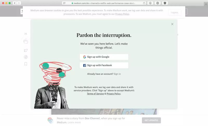
I just read this blog post by John Saddington, and I have to say, I 100% agree. Medium is a terrible user experience. When you visit the site, you get bombarded with signup/login modals and banners.
Let’s not forget the horrible experience with comments. Instead of a nice threaded layout like Reddit, you get “Show all responses”. Then if you want to go further in, you click through and have another “Show all responses” button.
Premium content is also a mess. It starts you off with “3 reads for free”, and then tries to get you to pay. It’s hard to know what is premium and what isn’t unless you’re paying attention. Then it gives you some sort of weird preview and tries to get you to pay again. As if this would really work…
There’s also a work around to reading the premium content for free. If you go incognito/private, then you can read premium content to your hearts content.
You can follow the thread further below to find out more of why Medium is a bad experience.

Scathing commentary on how Medium.com sacrifices their core reading experience to “maximize” engagement and conversion of new users – brutal af (but totally warranted): View story at Medium.com I’ve already shared my own perspective on Medium and how I think their time is desperately running out: Medium’s Time is Running Out Great products do not…


Member discussion